In this How To, you will learn: How to edit existing data-driven charts and add new ones to your PowerPoint file.
Covers data-driven dashboards, bubble charts, point charts, circle charts, line charts, etc.
- Pick a style from the PowerPoint Library.

- Download files you wish to use.
- Open the file in PowerPoint.
- If you are adding these slides to another file follow these steps here ».
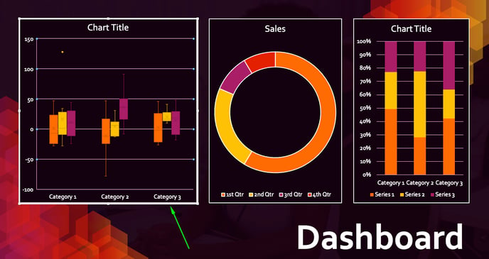
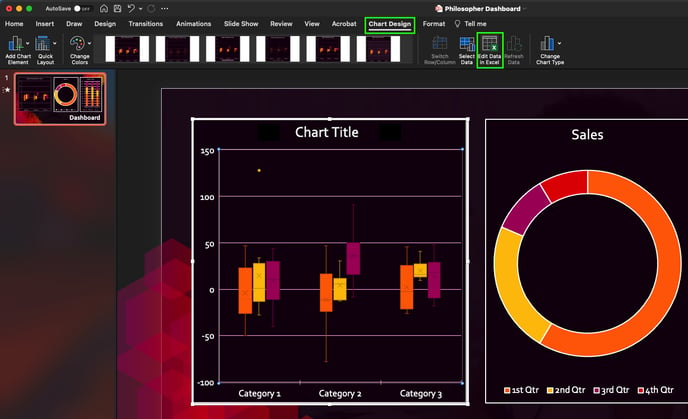
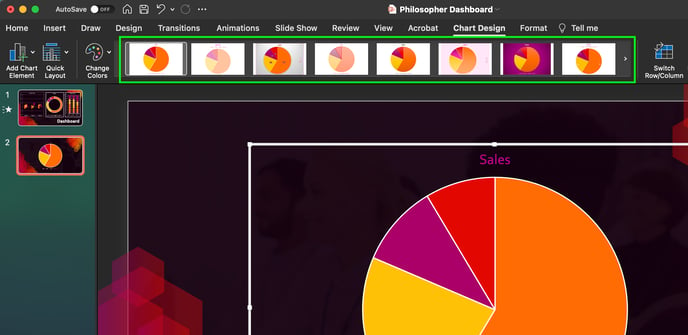
- To edit an existing data-driven chart, select the chart that you want to edit. A light gray box will appear around the chart you have selected.
- Then right click on the chart and select Edit Data in Excel OR navigate to the Chart Design tab and click on Edit Data in Excel in the ribbon.
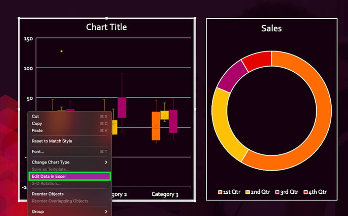
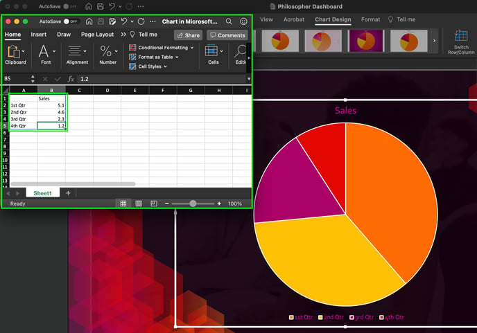
- This will open up the associated Excel sheet. From here you can start changing/updating the information in the spreadsheet.
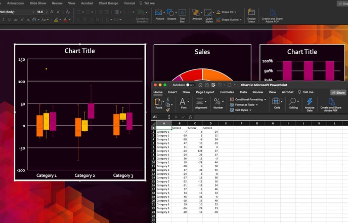
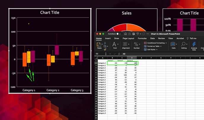
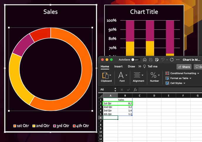
- Click on the cell you’d like to update, enter your new number in, and hit enter or tab on your keyboard to watch the change take effect in real time to the chart in PowerPoint.
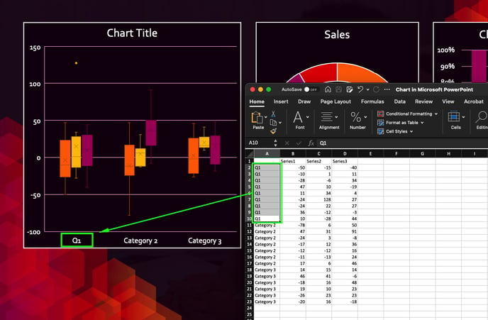
- Also, make sure to update any category or series names in the chart(s).
- When you are done making changes to that chart you may close the Excel spreadsheet window.
- IMPORTANT NOTE: Depending on the type of chart you are making changes to, the Excel sheet may be more or less complex. For example, this candlestick chart has multiple information points for each category in each series.
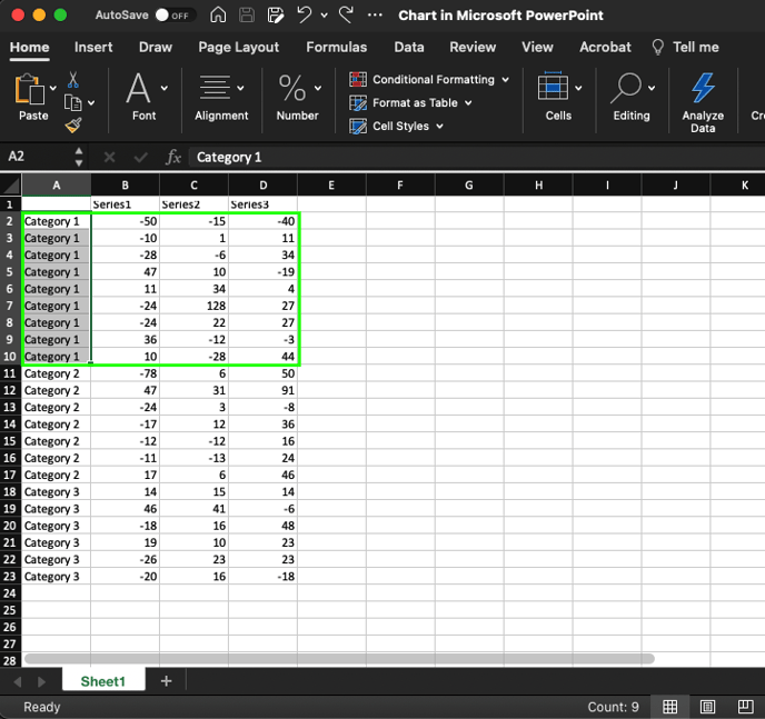
- Whereas this doughnut chart only has one data point per category.
- You may need to play around adjusting data points to better understand how the information from the Excel sheet is being pulled over to the PowerPoint chart.
- IMPORTANT NOTE: Depending on the type of chart you are making changes to, the Excel sheet may be more or less complex. For example, this candlestick chart has multiple information points for each category in each series.
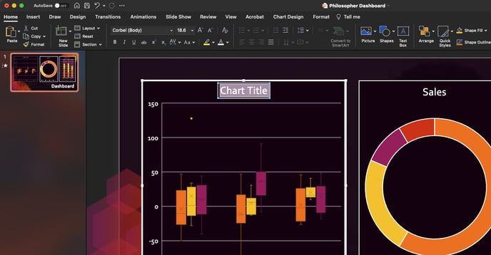
- Make sure to update the names of your chart(s) so that they are correctly labeled. To do so, click on the name of the chart and highlight the text.
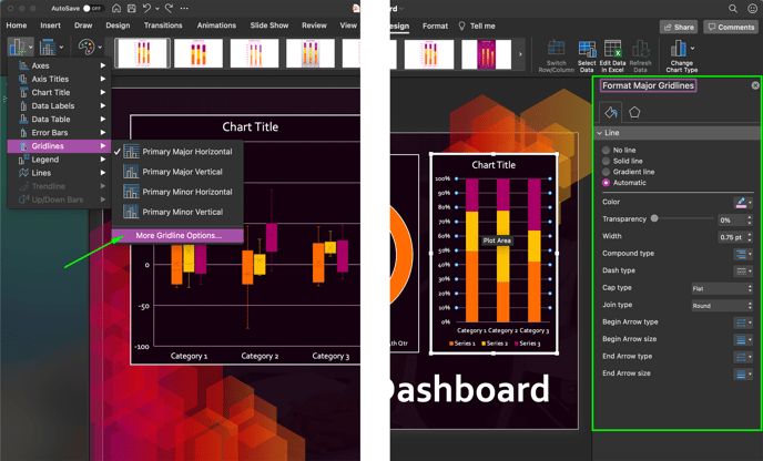
- To add or remove elements from a chart, select the chart you’d like to edit and click on the Add Chart Element dropdown. The elements you can add or remove can include but are not limited to; Primary Vertical or Horizontal Axis, Primary Vertical or Horizontal Axis Titles, Data Labels, Data Tables, Error Bars, Gridlines, Legends, Lines, Trendlines, and Up/Down Bars.
NOTE: depending on the type of chart you have selected, not all of these listed items may be available to add or remove.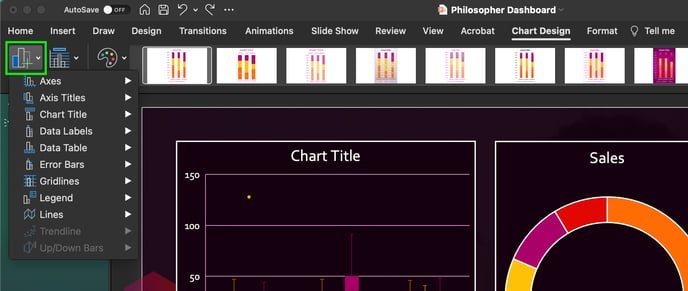
- By clicking on the More option at the bottom of the secondary dropdown (on any of the Add Chart Elements). A format pane (specific to the chart element) will pop up on the right side; giving you more control over the element you are editing.
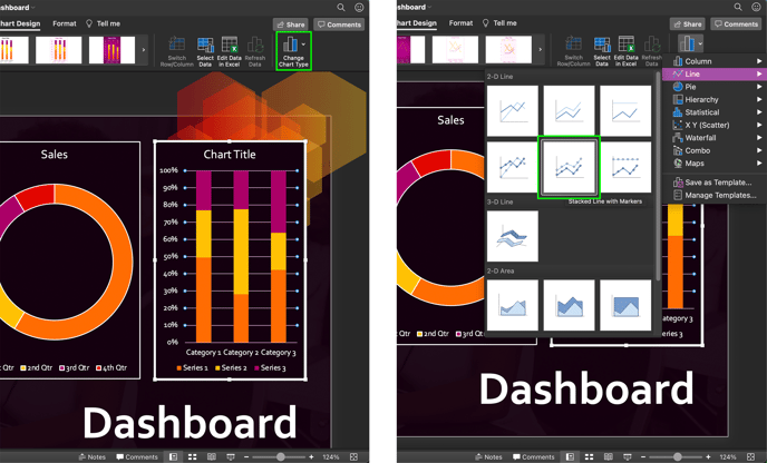
- You also have the option to Changing Chart type
- Select the chart you’d like to change and then click Change Chart Type in the Chart Design Ribbon. From that dropdown you can choose from a variety of different chart types. It will automatically remap the data for you.
- Select the chart you’d like to change and then click Change Chart Type in the Chart Design Ribbon. From that dropdown you can choose from a variety of different chart types. It will automatically remap the data for you.
- Then right click on the chart and select Edit Data in Excel OR navigate to the Chart Design tab and click on Edit Data in Excel in the ribbon.
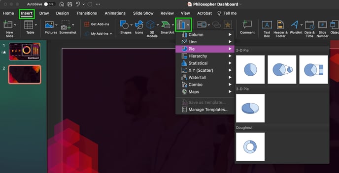
- To add a new data-driven chart, navigate to the Insert tab and click on Chart. From that drop down menu will have a variety of chart templates to pick from, such as Column, Line, Pie, Bar and more.
- Start by clicking on a chart type (in the drop down).
- Pro Tip: Consider the type of data you're showcasing when choosing a chart type. Here are a few common PowerPoint chart types, and the type of data they're used to show:
- Column Charts: a classic way to show values, with vertical lines showing values based upon their height.
- Line Charts: used to show data over a series of time, and how the value fluctuates over a time series.
- Pie Charts: show parts of the whole as slices, and help you relate the individual pieces to the total.
- Bar Charts: the horizontal counterpart to column charts, showing values as bars running from left to right.
- Area Charts: similar to line charts but highlight the area underneath the line as a sum.
- After you've selected a chart type, there are several variants of those PowerPoint charts available at the top. Click on one of the thumbnails above to select a more specific chart style.
- For this example, we’re going to create a pie chart.
- After inserting the chart, you'll see an Excel spreadsheet window open to add your data in.
- Note: Depending on the type of chart you chose, your spreadsheet may look different than this example. A stacked bar chart, for example, might have multiple columns with numeric values inside of the spreadsheet.
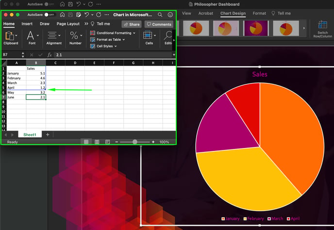
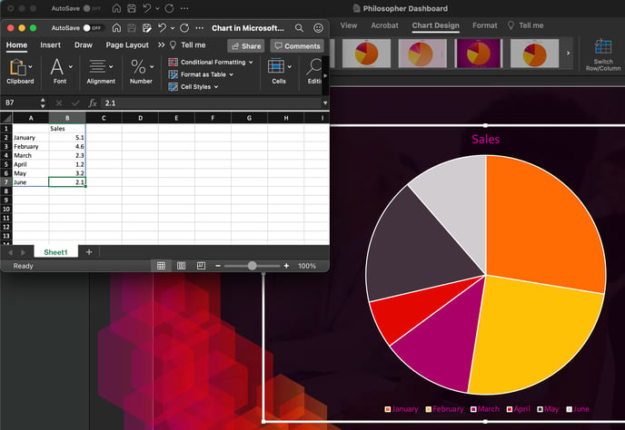
- As you input your data, the chart will update in real time. Each time that you change the values in the spreadsheet, the chart will change to align with your data.
- If you need to add more slices to your pie chart, just add more rows to your data. The blue bounding box should automatically expand to include any data you add. If it doesn’t, then grab the handle on the bottom right corner of the blue box around your data and pull it down to include the added rows/data.
- To reopen this spreadsheet view and edit your data, simply right click on the chart and choose Edit Data OR click on Edit Data in Excel in the ribbon. The embedded spreadsheet view will reopen so that you can update the data.
- Note: Depending on the type of chart you chose, your spreadsheet may look different than this example. A stacked bar chart, for example, might have multiple columns with numeric values inside of the spreadsheet.
- Start by clicking on a chart type (in the drop down).
- Don’t forget to save!
Repeat the steps above until your presentation is complete.
Pro Tip: Go back through your course/presentation in “presentation mode” to check that your slides are in the correct order and all your charts look correct.